An Introduction to Data Visualization: How To Tell a Story With Data

Hi, I'm Isaac, a multifaceted tech professional with expertise in data analysis, content writing, technical writing, video editing, product management, and customer service.
I enjoy using my diverse skillset to create engaging content and provide helpful solutions for readers and clients. Though my background spans many industries, my passion lies in leveraging technology and creativity to clearly communicate complex topics.
When I'm not writing articles or editing videos, you can find me learning new skills, keeping up with the latest tech trends, and looking for new challenges to tackle.
I'm excited to share my knowledge and continue growing as a professional.
INTRODUCTION
Have you ever tried to make sense of a large amount of data, only to feel overwhelmed and uncertain of where to begin? That's where data visualization comes in. Data visualization is presenting data in a way that is visually appealing and easy to understand. It helps to identify patterns, trends, and relationships that might not be apparent from looking at the raw data alone.
As a technical writer in this field, I understand the importance of data visualization in making complex information more accessible.
In this article, we will go through the basics of data visualization and discover how to tell a compelling story with data.
So, let's dive in and discover the world of data visualization together!
The Basics Of Data Visualization
Data visualization, a powerful tool for anyone working with data allows us to transform numbers and statistics into visual representations that can be easily interpreted and understood. In this section, we will cover the basics of data visualization, including its definition, types of data visualizations, and understanding of data relationships.
Data visualization is the graphical representation of information and data. It is converting data into visual formats, such as charts, graphs, and maps. By doing so, we can instantaneously identify patterns, relationships, and trends that might not be immediately apparent from looking at the raw data.
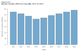
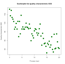
There are different types of data visualizations, each suited to different data types and presenting different insights. Bar charts, line graphs, scatter plots, and heat maps are just a few examples of the types of visualizations available.
Choosing the proper visualization and understanding data relationships is crucial to effective data visualization and communicating findings.
This involves identifying how different variables in the data are related to each other. For example, if you are analyzing sales data, you might want to explore how the time of day, day of the week, or season of the year impacts sales figures. By understanding these relationships, you can create visualizations that tell a clear and compelling story with your data.
There are different types of data visualizations, each suited to different data types and presenting different insights. Bar charts, line graphs, scatter plots, and heat maps are just a few examples of the types of visualizations available.
Choosing the proper visualization and understanding data relationships is crucial to effective data visualization and communicating findings.
This involves identifying how different variables in the data are related to each other.
For example, if you are analyzing sales data, you might want to explore how the time of day, day of the week, or season of the year impacts sales figures. By understanding these relationships, you can create visualizations that tell a clear and compelling story with your data.
Principles For Data Visualization
Picking the right chart type for your data is important, but it's not the only consideration when it comes to creating effective data visualizations.
You need to also choose the right colors for your visualization and this plays an important role in creating a visually appealing and effective chart.
Colors can be used to highlight important data points, create contrast, and guide the viewer's attention. However, it's crucial to choose colors that are not only visually appealing but also easy to interpret. Using too many colors or colors that are too similar can make the visualization confusing and difficult for your audience to understand.
Labeling and titling charts are also important for clarity. Your chart's title should convey what the data represents and what insights can be gained from it.
Labels should are used to identify the different elements of the visualization, such as axes, data points, or legends. By labeling your chart clearly, you make it easier for viewers to understand the insights you're trying to communicate.
Another important consideration when designing your visualizations is the need to make them visually appealing and easy to understand.
By choosing easy-to-read fonts, and avoiding cluttered or overly complex charts, you can create visualizations that are easy to understand and visually appealing.
Also, consider the size and format of your chart. If you're presenting data to a group, you might need to choose a larger format that can be easily seen from a distance.
Tools For Data Visualization
There are various data visualization tools available that can help you create effective visualizations. In this section, we will explore some of the most popular data visualization tools and how to choose the right tool for your needs.
One of the most popular data visualization tools is Microsoft Excel. Excel includes a wide range of chart types and is a great choice for beginners who are just starting to work with data. It's also widely used in business and academic settings, making it a valuable tool to learn.
Another popular tool for data visualization is Tableau. It is a more advanced tool and is often used in professional settings for its ability to create complex and interactive visualizations. It includes a wide range of chart types, and its drag-and-drop interface makes it easy to use for those with little to no programming experience.
Python and R are two programming languages that are commonly used for data analysis and visualization. They offer more flexibility and customization than Excel or Tableau but require more programming knowledge. They are popular among data scientists and analysts who need to create complex and customized visualizations.
When choosing your data visualization tool, it's important to consider your expertise and the complexity of the data you're working with.
For beginners, tools like Excel or Google Sheets are a great place to start. For more complex visualizations or larger datasets, Tableau, Power BI or Python/R will be a better choice.
Effective Strategies For Data Visualization
1. Understand Your Audience: The foundation of any successful data visualization is in understanding your target audience.
Consider their level of expertise, their goals, and the specific insights they seek. Tailoring your visualizations to their needs will help you choose appropriate chart types, prioritize key data points, and employ a suitable level of detail.
2. Keep it Simple: The best visualizations are often the simplest ones. Avoid cluttering your visualization with unnecessary information or design elements. Stick to the basics and let the data speak for itself.
3. Choose the Right Chart Type: Your data type determines the types of visualizations to use. It's important to choose the right chart type to effectively communicate your data.
4. Highlight Key Insights: Your visualization should highlight the key insights and patterns in your data.
Utilize visual cues such as color, size, or annotations to draw attention to the most significant findings. Consider using interactive elements that allow users to explore the data themselves and uncover additional insights.
5. Tell a Compelling Story: A successful data visualization tells a story, capturing the viewer's attention and conveying the message effectively.
Frame your visualization with a clear title and supporting context to guide the audience's interpretation. This will help your audience understand what they are looking at and what the data represents.
6. Test and Iterate: Experiment with different visualization types and design elements. Test your visualizations with a sample audience and iterate based on their feedback.
Why Data Visualization?
Data visualization has several advantages, including:
Easy Interpretation: With a visual representation of data, information is presented in an easy-to-understand manner. Complex data can be broken down and presented in a way that is easier to comprehend.
Enhanced Communication: Visuals are more engaging than raw data, making it easier to communicate complex information to stakeholders. Visualizations can also help build consensus among teams and aid in presentations to management or clients.
Improved Decision-making: With data visualization, you can easily identify trends and patterns that might not be immediately apparent with raw data. This allows you to make more informed decisions and take action based on data-driven insights.
Time-saving: With data visualization tools, you can quickly create charts and graphs without spending hours manually creating them. This can save time and allow you to focus on analysis and decision-making.
Predictive Analysis: With data visualization, you can identify patterns and trends in your data that can help you make predictions about future trends or behavior. This can help you plan for the future and take proactive measures to address potential challenges.
Examples of Effective Data Visualizations
Below are a few noteworthy real-world examples of successful visualizations and the key factors that made them effective
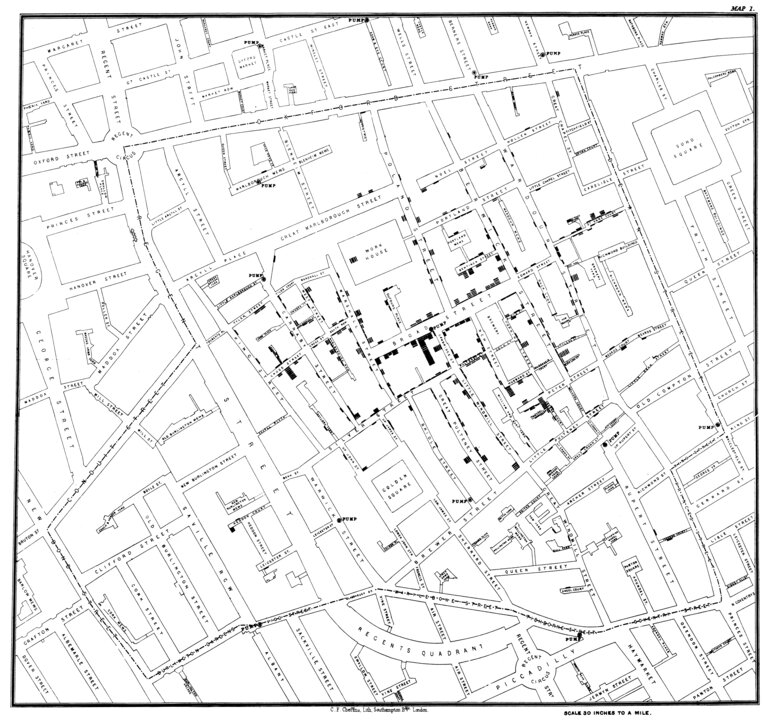
John Snow's Cholera Map: During the 1854 cholera outbreak in London, Dr. John Snow created a map showing the locations of cholera cases and water pumps. This visualization revealed a pattern, with a concentration of cases around a specific pump on Broad Street. It effectively demonstrated the connection between contaminated water and the spread of the disease.
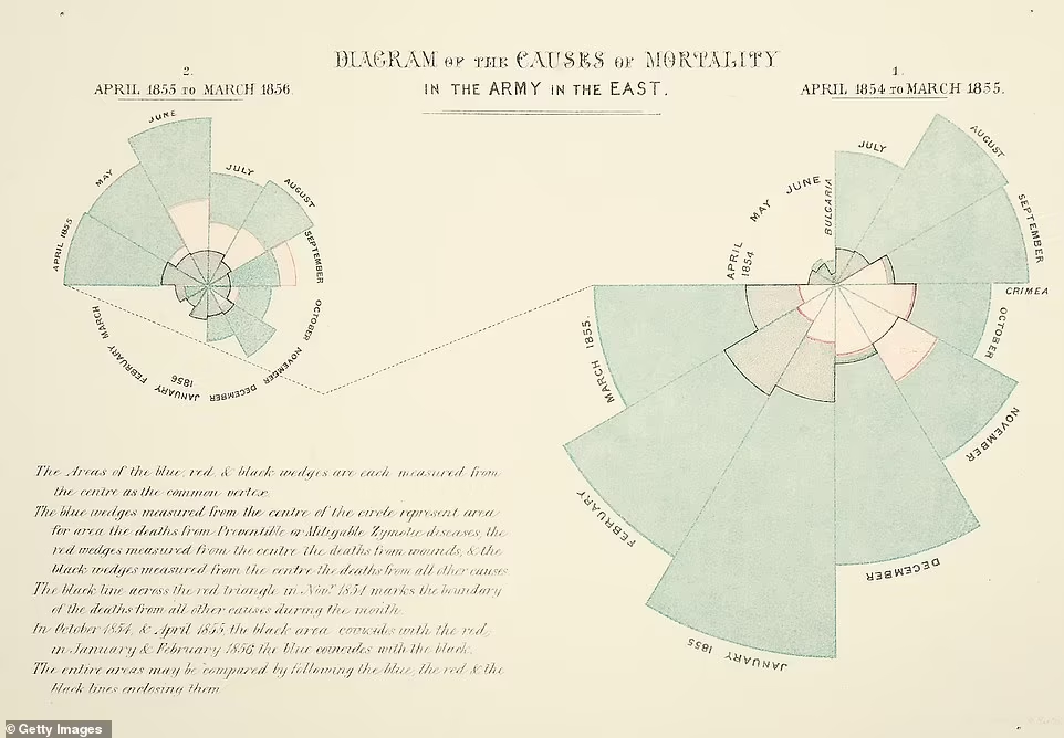
Florence Nightingale's Rose Diagram: Florence Nightingale, a pioneer in nursing, created the Rose Diagram to present mortality rates and causes of death among soldiers during the Crimean War. The diagram used a polar area chart to represent different causes of death, with each segment's size indicating the proportion of deaths. This visualization effectively conveyed the significance of preventable deaths due to unsanitary conditions, highlighting the need for improved healthcare practices.
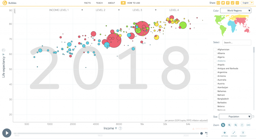
Hans Rosling's Gapminder: Gapminder is an interactive tool that visualizes global socio-economic data. It allows users to explore indicators like income, life expectancy, and population across countries and over time. Gapminder simplifies complex data, making it engaging and easy to understand for beginners.
What makes them effective:
Florence Nightingale's Rose Diagram simplified complex mortality data through a visually striking representation, emphasizing the importance of specific causes of death.
Gapminder simplifies complex global data, allowing beginners to explore and understand socio-economic indicators through interactive visualizations.
The Cholera Map effectively communicated the source of the outbreak by visually correlating cases with water pump locations.
Conclusion
Data visualization is a powerful tool for anyone working with data. It enables you to tell a story with your data, uncover hidden insights, and communicate complex information in a way that's easy to understand
By following the best practices outlined in this article, you can create effective visualizations that highlight important insights, without overwhelming your audience with unnecessary information.
Remember to keep your audience in mind, use the appropriate visualization techniques, and focus on the story you want to tell.


